Corporate
Doroob
Bettering a brand for the betterment of society
Doroob is a non-profit organization that focuses on the betterment of society by empowering leaders for positive change.
With an organization that has grown and diversified rapidly, Doroob needed to communicate their new position and tidy up their brand architecture.
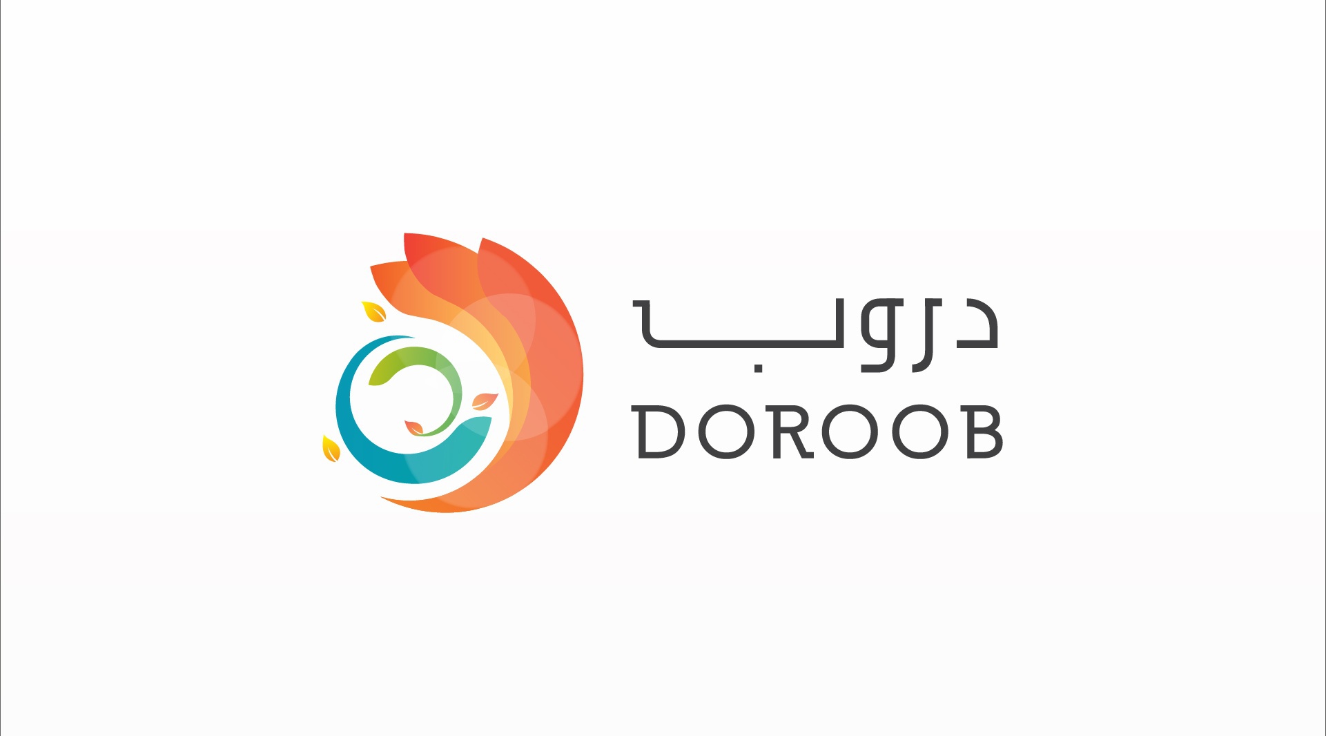
Doroob identity
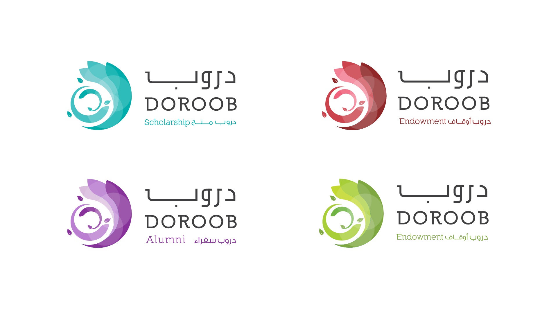
Reflecting the continuous movement, growth and development of the individuals Doroob empowers was a key component of the brief. The leaves of the logo represent a growth that intensifies while the colours show the diversity of talents, and the circle demonstrates a holistic cycle of empowerment and support. The brand architecture took a two-pronged approach, using both an endorsed strategy and a house of brands, allowing larger projects to retain their own identity, whilst creating a system for the mother brand.
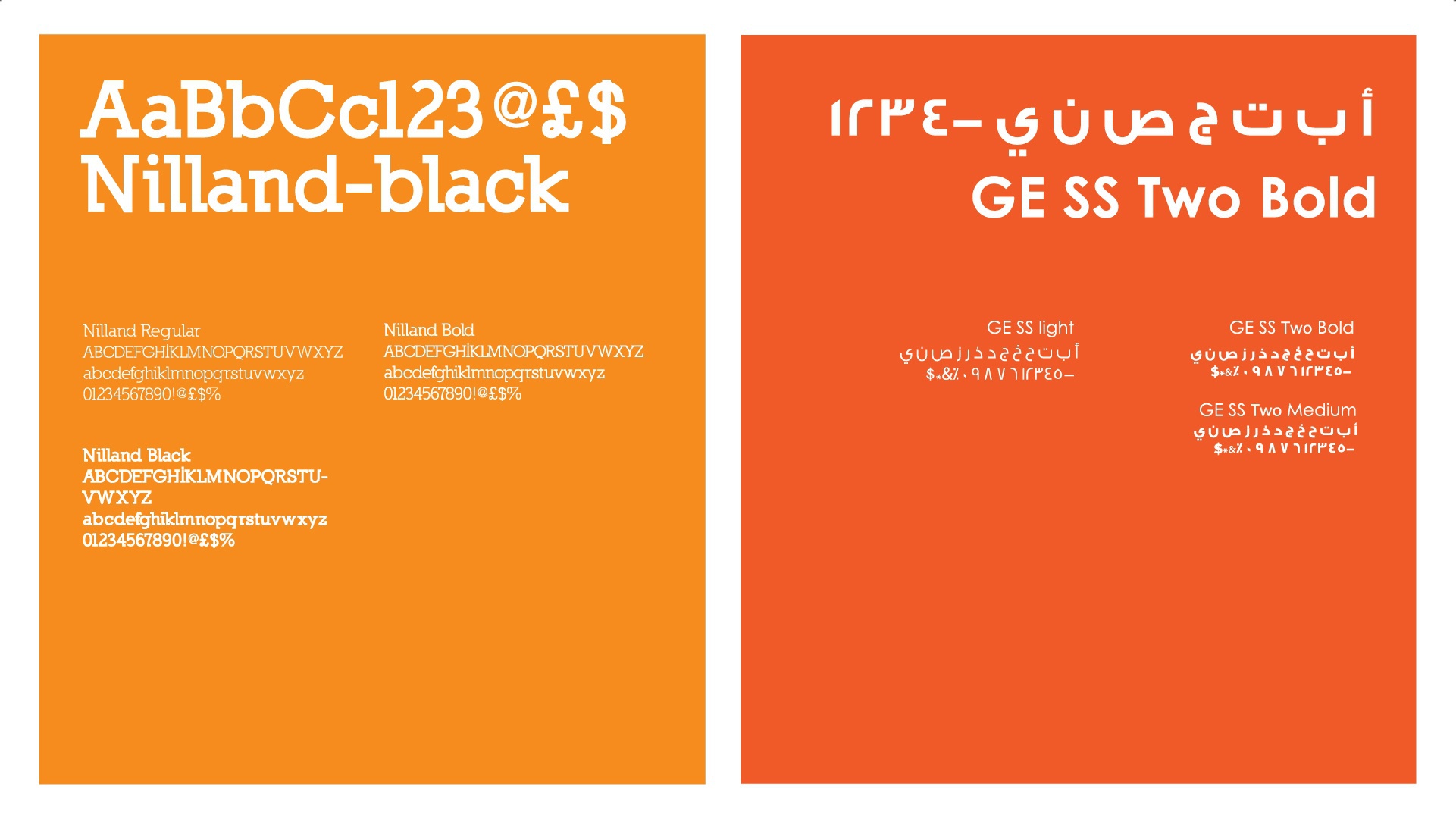
Typeface family
Logotype scheme

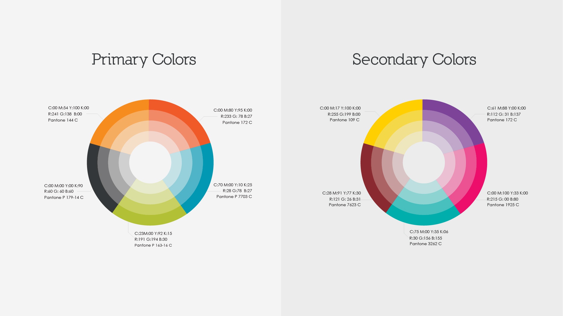
Color scheme
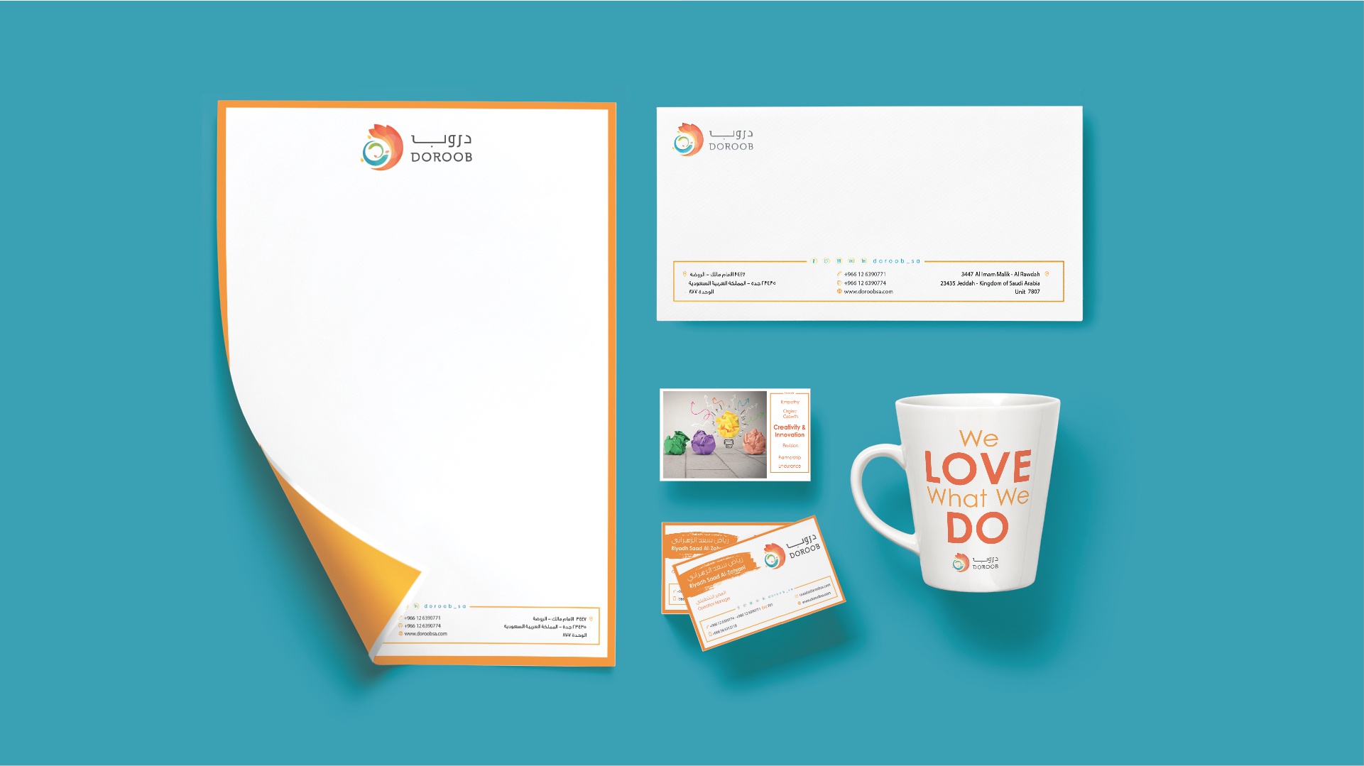
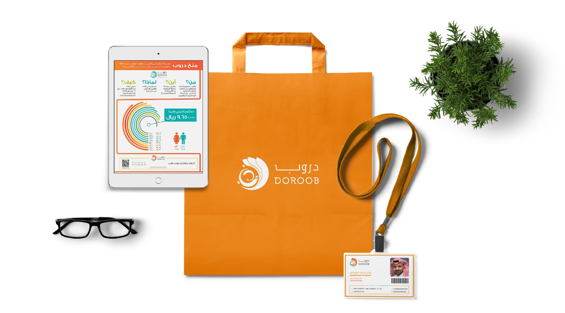
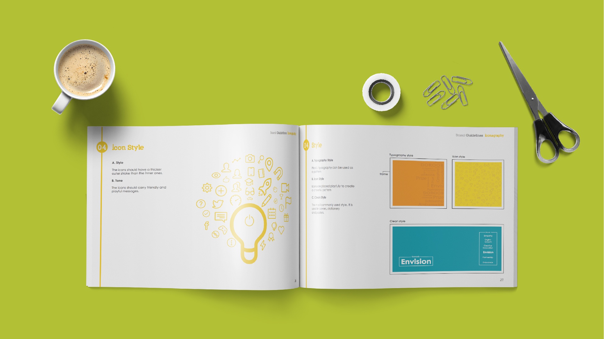
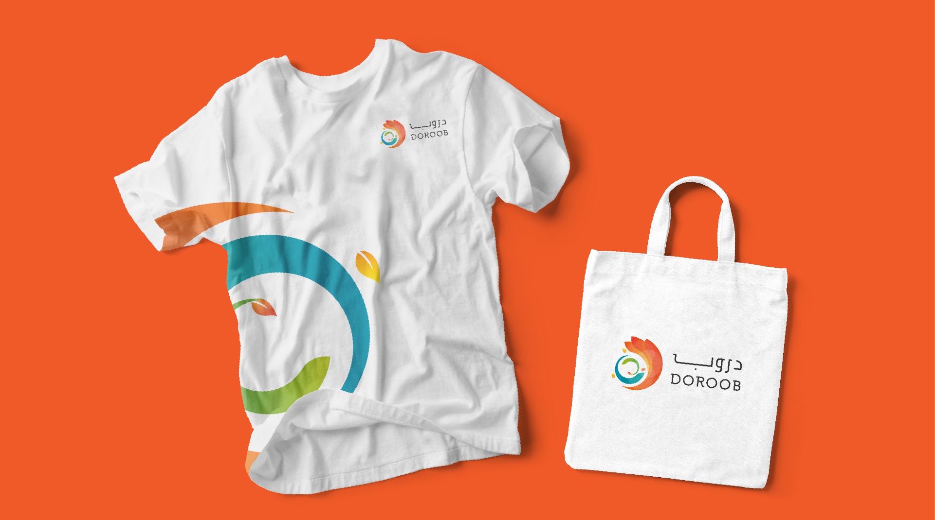
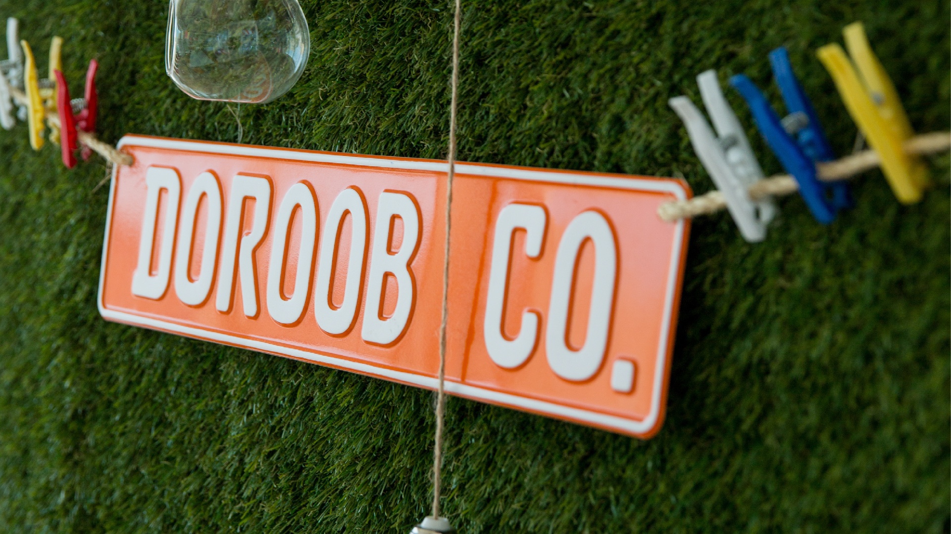
Print & additional design work
The overall effect was of a professional organisation with a clear brand that has helped establish international partnerships for Doroob. All the while, retaining the non-corporate style and free spirit of the identity.
